UX/UI case study · end to end · 2026
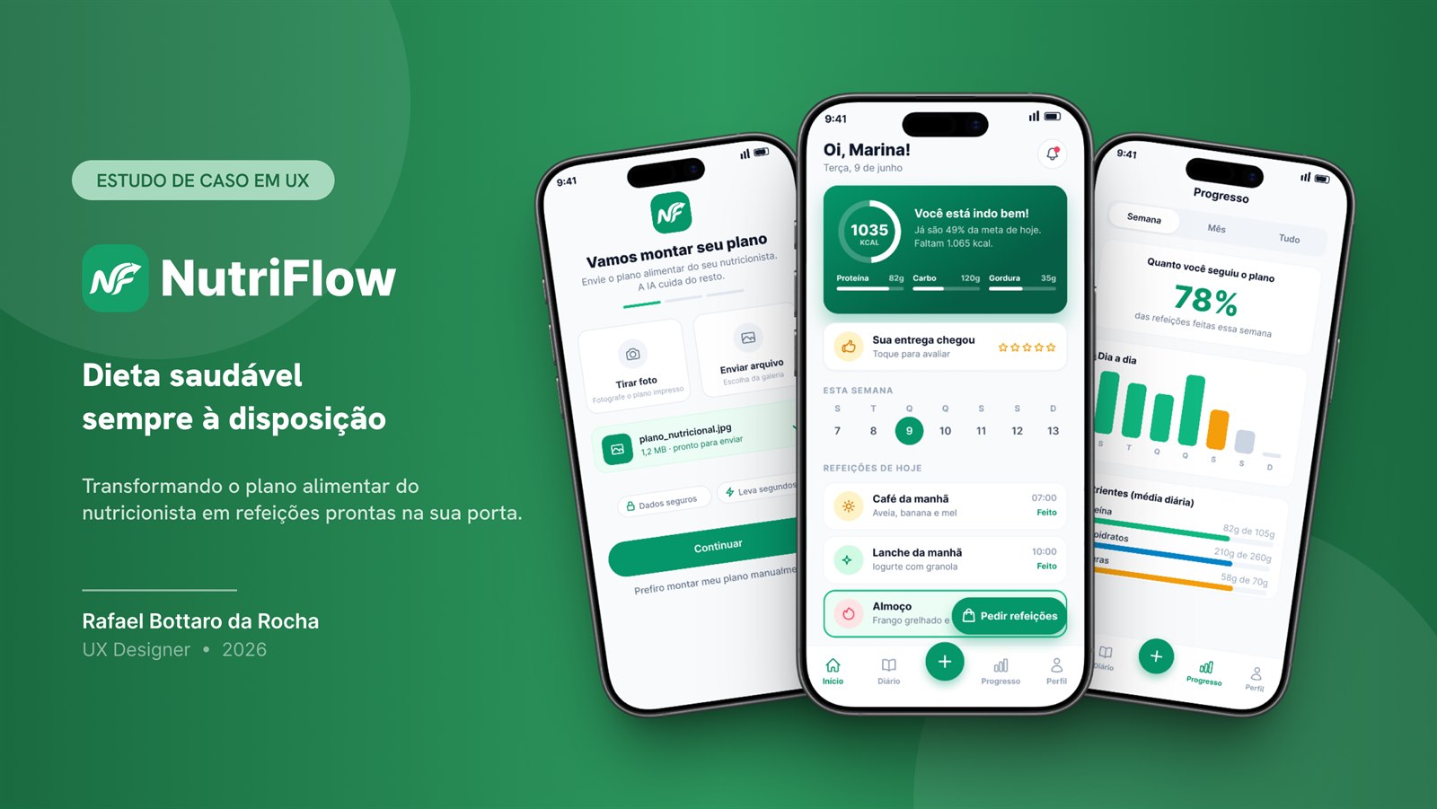
NutriFlow, healthy eating always within reach
Turning the nutritionist's meal plan into ready meals at your door, as easy as ordering delivery.
The problem and the solution
Problem. People need to follow a diet prescribed by a nutritionist, but they struggle to prepare or order those meals, because they're personalized and made by hand.
Solution. NutriFlow is an app that turns the nutritionist's meal plan into a practical routine: the AI reads the uploaded plan (photo or PDF), organizes the meals automatically, and delivers them ready at home, helping the user stick to the prescribed diet.
How do you make following a diet as simple as ordering on iFood?
That's the problem NutriFlow sets out to solve: the gap between what the nutritionist recommends and what a person actually eats day to day. I compared it to iFood on purpose, the convenience benchmark everyone already has in mind, and it makes the gap obvious: ordering junk is easy, sticking to the diet is the hard part.
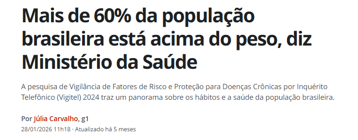
The healthy-food market in Brazil is huge and still growing. According to the Ministry of Health (2024), more than 60% of Brazilians are overweight, and the healthy-eating market moves over R$ 40 billion a year in the country.
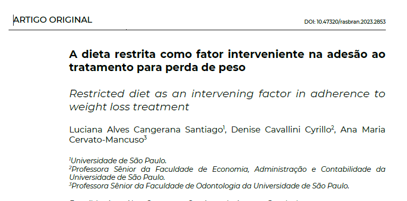
A qualitative USP study of patients who dropped out of nutritional treatment (Santiago et al., 2023, RASBRAN) found difficulty accessing food to be one of the five main categories of reasons for dropping out, alongside how strict the diet is and how hard it is to fit the plan into daily life.
Benchmarking and the CSD matrix
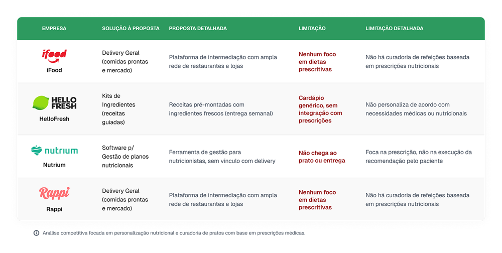
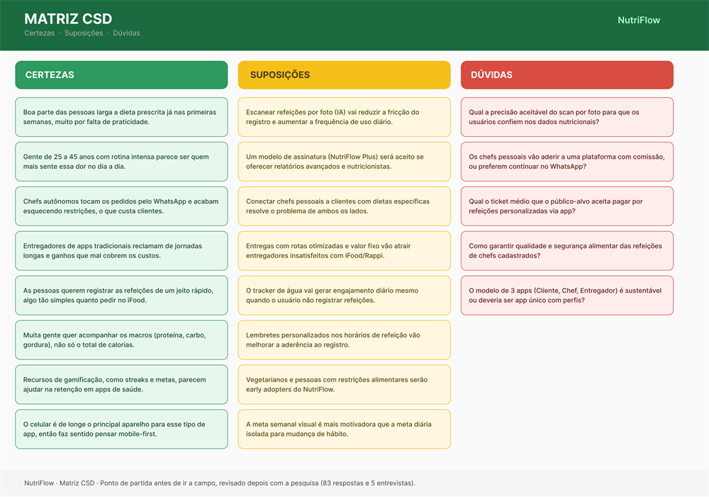
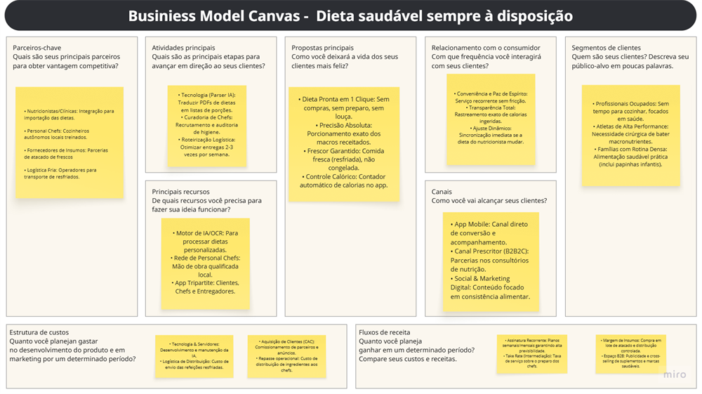
I analyzed the food-delivery, meal-kit, and nutrition-software markets, looking for where those services fall short and where there was room for something new: a solution truly focused on meals personalized and adapted to medical prescriptions.
Before going into the field, I used a CSD matrix (Certainties, Suppositions, Doubts) as a filter. Instead of asking everything, it showed me where I was too confident without proof. The Suppositions became the research script, and the costliest Doubts (pricing and chef buy-in) were the first ones I went after.
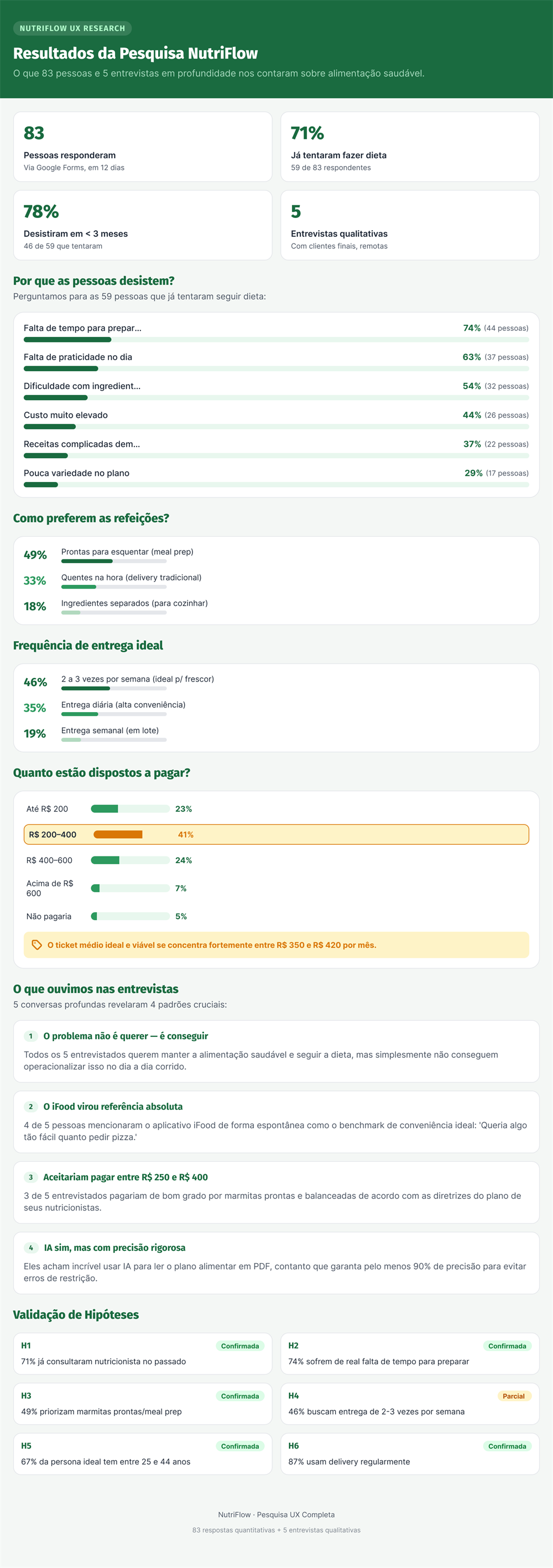
83 respondents and 5 in-depth interviews
Quantitative research (83 respondents via Google Forms) combined with qualitative (5 remote interviews with end users, 20 to 30 min each, over Google Meet).
What came up in the interviews
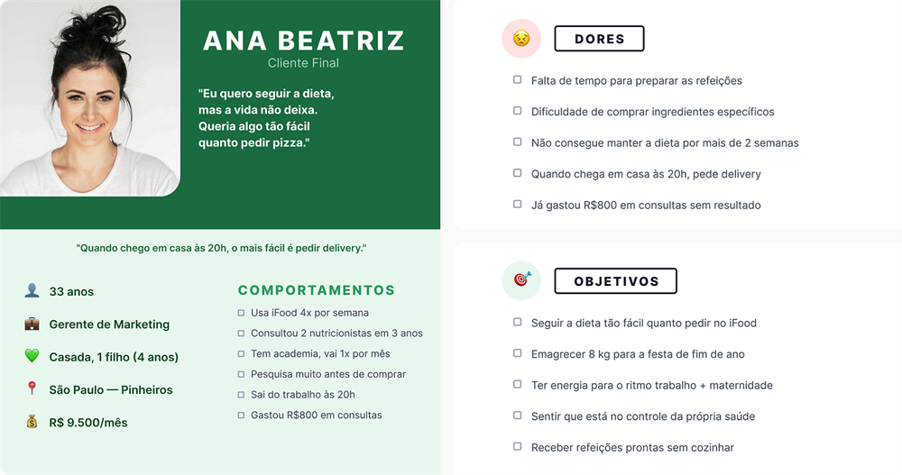
“I've had the diet printed on my fridge for 3 months. I followed it for 2 weeks. The problem is that day to day it's impossible: you leave work at 8pm, you have a kid waiting, who's going to cook?”
Ana, 33, marketing manager
“If there were an app that took my plan and turned it into meal boxes, I'd easily pay R$ 300 a month.”
Thiago, 36, data analyst
Interview takeaway: people don't quit the diet for lack of willpower. They quit because, in the daily rush, they have no way to execute the plan. 4 of the 5 interviewees named iFood as their convenience benchmark.
Persona and user journey
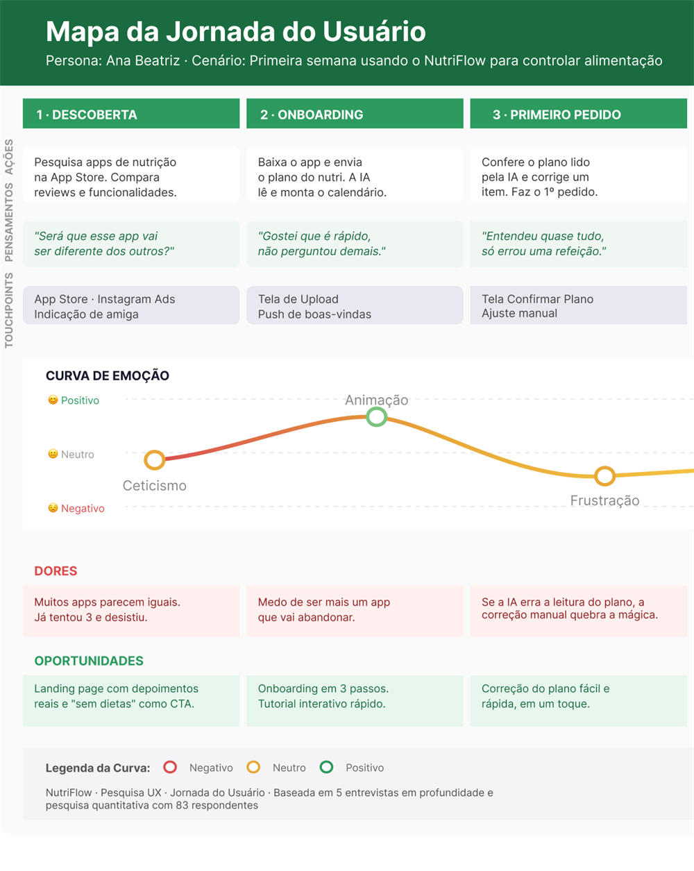
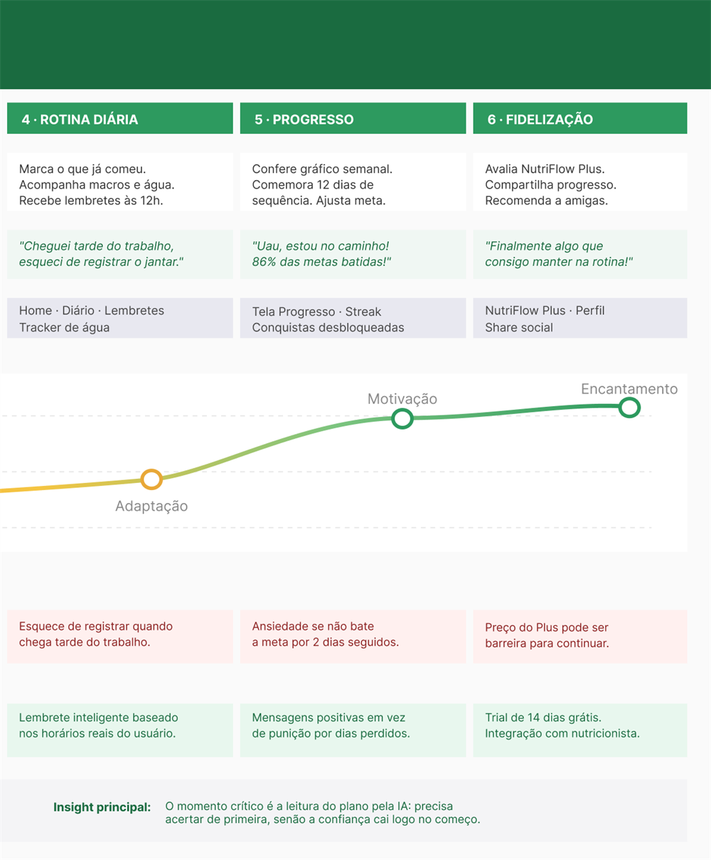
With the persona in hand, I mapped what Ana's first week in the app would look like, phase by phase, to find where the experience lifts and where it falls apart. More than listing screens, I wanted to find the most fragile moment, the one that decides whether a person stays or gives up.
The emotion curve pointed to that moment: right at the start, when the app has to read her plan. If the AI misreads it up front, the person loses trust and rarely comes back. That's what made me treat reading the plan as the most critical part of the product, not an onboarding detail.
An ecosystem of 3 apps, an MVP focused on the Customer
- Customer · sends the nutritionist's meal plan and receives the ready meals.
- Personal Chef · receives orders, buys ingredients, and prepares the meals.
- Courier · handles deliveries according to the plan.
I started with the Customer for a simple reason: they're the one who feels the pain and pays the bill. Without validated demand on that side, it wouldn't make sense to touch the chef's or the courier's app. So this study covers only the Customer app, from uploading the plan to the order arriving at the door.
Workshops, HMW, and wireframes
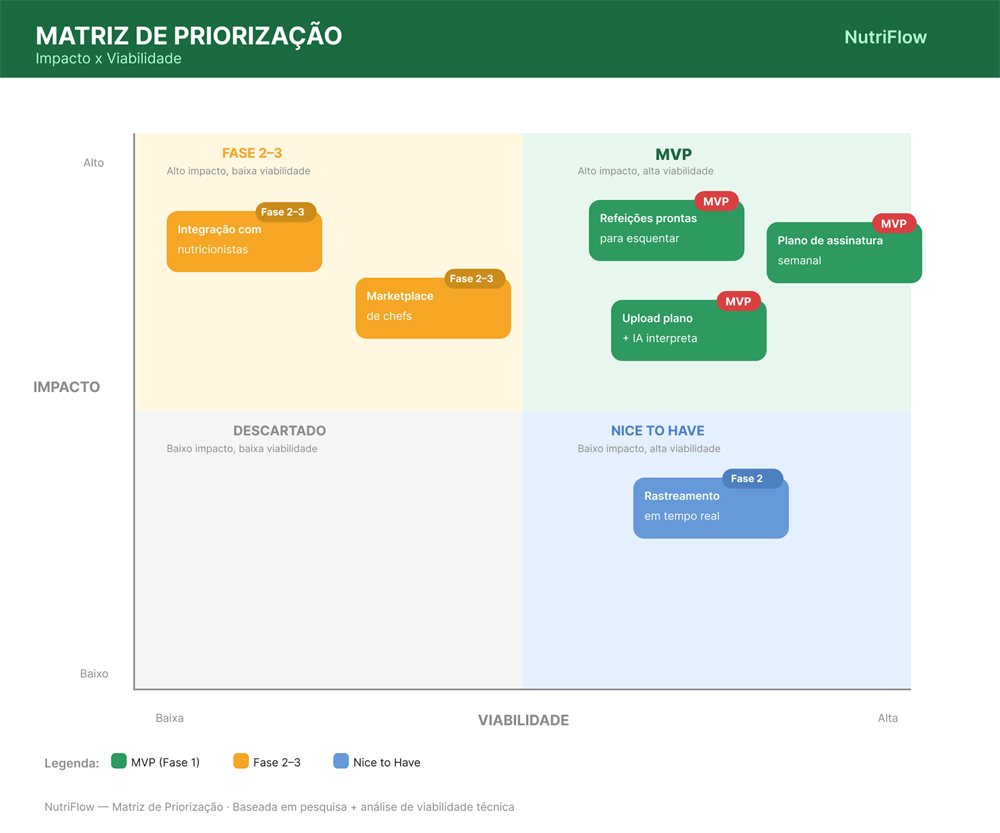
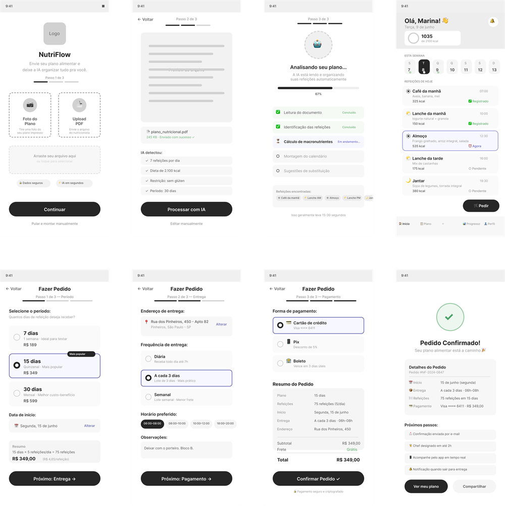
After prioritizing ideas on an impact-vs-feasibility matrix, I prototyped the 4 main flows in low fidelity: onboarding and upload, AI processing, Home (My Plan), and placing an order.
Design System
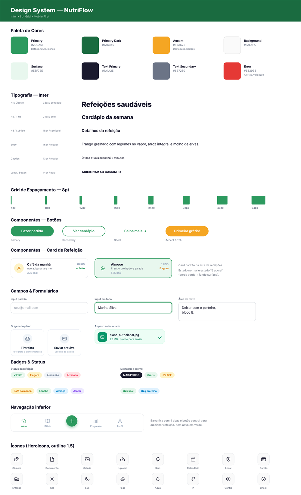
Green is the base color because the app is about food and health, and green already carries that idea without explaining. I kept orange only for what needs attention right now (the current meal, an alert), so it doesn't compete with green day to day.
Typography: Inter, the native font on iOS 17+ and Android 14+. Since people already see it every day, reading feels more familiar (Jakob's Law).
Accessibility: minimum 4.5:1 contrast (WCAG AA), 44×44pt minimum touch targets, Dynamic Type, and labels on every icon.
Three decisions guided the screens
1. The AI reads the plan; the person types nothing. Research showed that logging food by hand is exactly what wears people out and makes them quit apps like MyFitnessPal. If the goal is to take effort out of the way, asking someone to log every meal, every day, would just repeat the problem. So they photograph the plan and the AI builds the calendar.
2. Ordering fits in three steps: period, delivery, and payment. Early versions had more steps, and every extra screen was a chance to give up. The closer it feels to ordering food, the lower the friction.
3. The Home answers a single question: “what do I eat now?”. The current meal is front and center and everything else is secondary. Fewer decisions on screen, less room to break the diet.
Interactive prototype
Explore the app from the inside From uploading the plan to the order arriving at the door, in the high-fidelity flow.Usability test
Moderated remote test with 5 participants (25 to 45 years old, delivery users), with a Figma prototype shared via link + Google Meet, 20 to 30 min per participant.
| Task | Success rate | Average time | Errors |
|---|---|---|---|
| Upload the meal plan | 80% (4/5) | 1m 42s | 1 couldn't find the PDF |
| Place an order | 100% (5/5) | 58s | None |
| Check delivery details | 60% (3/5) | 2m 10s | 2 wrong tab |
| Rate the delivered meal | 100% (5/5) | 34s | None |
Critical issues and fixes
- The upload button was easy to miss. One participant couldn't find where to upload the plan. I trimmed upload to two options with equal visual weight: take a photo or pick from the gallery.
- Tracking was hidden in a tab. Two people looked for delivery status in the wrong place. I moved a tracking card to the Home, where they looked first.
How I'd measure success
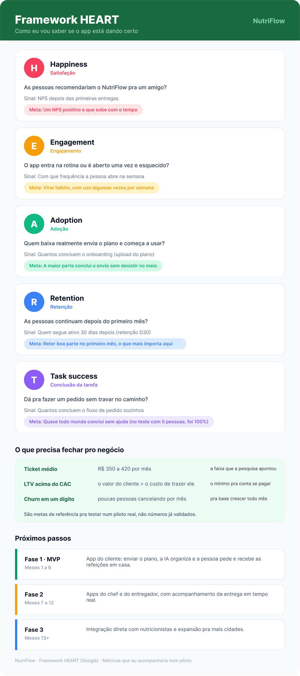
I used the HEART framework to avoid vanity metrics. Downloads and order counts matter, but what really counts is adherence: is the person still following the diet after a month? That's the number that tells you whether the product solves the problem or just looks nice.
What I took away
NutriFlow doesn't replace the nutritionist. It just makes it possible to follow what the nutritionist has already prescribed.
The project grew out of a real problem that affects millions of Brazilians: the gap between the meal plan and daily execution. The research made it clear that what stops people isn't motivation, but the lack of time and convenience: 78% quit the diet within 3 months, and 74% point to lack of time as the main reason.
Remote tests with 5 participants showed the direction made sense: the ordering flow hit 100% success, in 58 seconds. The SUS of 78/100 points to good usability, with room to improve.
Try NutriFlow from the inside
Open the high-fidelity interactive prototype, or see the full case study on Notion.